Showing posts with label Jam. Show all posts
Monday, September 15, 2025
1990s Image Comics Jam Void detail art by Jim Starlin & Pablo Villalobos
With the Starlin layout, the level of detail was highest to the fore, at the bottom of the page. Aside from some loose figure work, he'd spent the most time on Void's face and left hand. It wasn't a lot, and he'd gone into greater detail on other characters in her proximity, but this was still recognizably Starlin. That's clearly a Starlin woman's face, which is where the embellishment comes in. Pablo Villalobos asked me a couple of times who this artist was, and I'm not confident he recognized Starlin's name. When I enquired about his willingness to ink a figure, he fairly promptly picked Void from Jim Lee's WildC.A.T.s, whom he knew well and did not require reference for.
I don't keep up with modern comics, especially Marvel, especially the X-Men family. I did not know of Pablo Villalobos work until I was doing last minute reference for the 2025 Eastern Rim Funny Book & Vintage Con, which I was aware existed for several years via antique mall fliers, but had never attended. I was told about the Saturday show on Thursday, and mostly went on the false hope of getting something from Kevin Nowlan. But once I saw Villalobos art, I was totally blown away. Adam Hughes is an obvious influence, but he has darker and more textured elements to his art, recalling-- I dunno, the late Nick Manabat? It's an unusual but delightful combination, as I'd never expect Higer elements mingled with the more cheesecake elements of the Majik. I'm not sure if this Pablo Villalobos is the same guy who did some turn of the century work at Penny Farthing Productions (he didn't look old enough,) but the artist who signs as "Lobos" exploded onto the scene in the past few years with very striking cover work (that demands serious money on the aftermarket.) I figured getting him to do a modest ink job was a long shot, and was gob-smacked when he said "yes" for a relative pittance.
While the Starlin fan in me had hoped for greater fidelity to his line on one of the few characters in the piece that he'd rendered enough to actually look like a Starlin drawing, Lobos was a get who knew the character of Void and his way around a gleaming metal smokeshow way better than Jim. I love what hev did here, and I think this work will task future embellishers with living up to his example. A sweet start to this project!
Pablo Villalobos
Tuesday, August 26, 2025
Image Comics 25th Anniversary Jam Savage Dragon & Friends detail by Evan Dorkin
It's been nearly two years since our last post here, and I'm sorry about that, but we just haven't been able to get it together to produce new episodes of the podcast. Since that's not getting updated, these art posts also fell by the wayside, plus the jam still isn't completely colored yet. But Frank was working on a bunch of art posts on his blogs to clear out a bunch of un-shared commissions, and figured to give the old Spawnometer a little love.
We all love Evan Dorkin, so he was always a lock for contributing, but it ended up in "take home" capacity. At one point, he was asked about drawing Shadowhawk, but he begged off because he never could figure out the physics of that damned helmet. Ultimately, the plan was for him to finish over Neal Adams' Pitt breakdown, and then draw Officer Dragon entirely in his own style. You can see his rough layouts in previous posts. We both wanted to fill in empty space, which is how Bomb Queen, Trencher, She-Dragon, & Boof and the Bruise Crew ended up in the mix here. Unfortunately, FedEx Express copiers could not fit full 11x17" scans, so the uppermost portion of this image was cut off. In the actual art, you can see the point and first scallop on Dragon's fin, and the lowest hanging portion of She-Dragon's Mohawk to its tip. I can't do a new scan, because this is one of the ones that I did get colored. Anyway, all of these art great fun to look at, and you've gotta love the battle-damaged uniform. Keith Giffen was still with us when this was done, and I always dug how Dorkin adapted to that wiry Trencher style, but it's especially meaningful to me today.
Sunday, August 20, 2023
2019 Fandemic Tour Fortress colors by Daniel Dahl
As previously mentioned, I tried to complete the Image Comics 25th Anniversary Jam over the weekend of the 2017 Heroes Convention. The piece went home with artist Evan Dorkin, who did an extraordinary of expanding and solidifying the overall... er... image, though I have to date only shown off the Background Roughs. After I got the finished linework back, against the advisement of Dorkin, I began to get the figures colored in 2019. Then COVID happened, which was still casting its shadow during Image's 30th anniversary celebration last year, meaning I'm still working on the those colors six years later. Further, production of the Spawnometer podcast has slowed to just a few times a year, leading me to neglect the related blog and sit on completed art elements. All caught up? Okay, so Daniel Dahl did a wonderful job of fleshing out Gilbert “Beto” Hernandez's sketch of Rob Liefeld's Supreme, and gave his brother Jaime “Xaime” Hernandez the same treatment on Whilce Portacio's Fortress. As much as I enjoyed my themed misadventure of having creator-owned comics pioneers draw the Image founders' characters, I really feel like the colors took the project to another level, and I have to thank talents like Daniel Dahl for providing for and proving that to be true.
Daniel Dahl
Sunday, September 25, 2022
2019 TERRIFICon Witchblade colors by Paul Mounts
It's been over a year since my last update post on this jam, begun in 2017 for the 25th anniversary of Image Comics, and almost completely missing the entire year of the 30th anniversary, a hell of a thing for a piece intended to be completed in a single weekend. I started out with such good intention in January. Anyway, setting aside any Image Comics lateness jokes, here is the first of the figures I got colored after getting the finished art back from Evan Dorkin. He'd warned me against getting additional colors as a threat to the integrity of the piece. Obviously, the central Spawn figure was colored by Joseph Michael Linsner from the beginning, but even one addition would be a commitment to doing many more. Further, depending on the coloring, the inks could easily be marred.
I debated on the matter for a while, but ultimately I felt like the piece would feel incomplete with one color figure. As important as Spawn is to Image and to myself, this is an image representing the full stable. At minimum, I wanted the founders' characters to get the same treatment. So, while on a road trip to visit friends in Canada and Boston, we made a detour to Connecticut, where I ended up running into Dr. Anj ahead of schedule. It was a fun mid-sized con hosted by a sprawling casino with a nice showing of actual comics talent, but I only had one day to spare for the show. I had specific things I wanted done and plenty of options, but oddly I think this is the first effort from that show to get posted. Most of the rest were more personal, or for other projects even further from fruition.
Paul Mounts was one of the first "name" comics colorists that I knew of. He had colored most of Marvel Comics' trading card sets in the late '80s & early '90s, a huge deal to that generation of fans, which got him notices in Wizard Magazine. He later colored nearly 100 issues of Fantastic Four, including the runs of the Waid/Wieringo and Hickman, the first volume of The Ultimates, and the run of Immortal Hulk. He even has an Image connection through work on Brigade, The Tenth, and Tellos. I recall particularly liking his flesh tones, so Witchblade was a natural choice.
Mounts shared Dorkin's reservations about the potential for inks running, and those concerns proved to be well founded. With the tools available at the con, the coloring ran into problems, and the attempted fixes are readily apparent. I still really like the tones throughout the piece, like the insectoid chrysalis yellow-brown within the gauntlet, and the shading in the hair. Obviously I worried that other colorists would have similar issues, but if anything, the flaws here encouraged me to get more coloring done to minimize the distraction. Blessedly, so far so good on later efforts, and I really prefer the piece with the colors. The question at this point is how far out to extend the color, as most of the main figures are done at this point. Blame COVID, poor convention scheduling in my area, and skyrocketing original art prices for this still being a work in progress.
Monday, August 9, 2021
2019 Fan Expo Boston Invincible colors by Sid Ven Blu
It's funny, because I'd read the first trade of Invincible and a few odd issues besides, but it wasn't my bag, so he was the character of least personal interest at the time of commissioning Tom Yeates. Since then, I've watched the first season of an animated show that probably wasn't in production in 2017, and am now much more informed and enthused about that property. Anyway, the core art for the jam was done during a weekend stay in North Carolina, and finished out of state. Once I got the original art back, I wanted to try to maintain a non-Texas approach and get the colors done on a road trip. The first new color job ran into problems, so I was apprehensive about the second, but how could I just have two characters done and stop?
So at the piece's third show, I was on the lookout for a color artist, and stumbled upon Sid Ven Blu. To my knowledge, she was an unknown at the time, so I only had her color originals at the table to judge from, but was impressed. It's also a really unusual request in my experience to have one artist color another's, at least in the realm of commissions. As I recall, Ven Blu generally worked in water colors, but that would have warped the paper and possibly interacted with the ink. I think she had some markers, or got some on loan, but still approached the project with trepidation. Thankfully, everything worked out swell, and she has since gone on to professional coloring work on IDW's Transformers (with the accompanying fan wiki stub.
"Isadora Venturini Blu, alias Sid Ven Blu, (born 1992) is a Chilean artist. Born in La Serena, Sid Ven Blu initially graduated from la Universidad del Desarrollo in Santiago to study digital illustration. She later attended The Kubert School of art in New Jersey, USA, to focus on coloring by hand. Sid Ven Blu enjoys drawing mechanical designs both traditionally and digitally." My girlfriend was especially pleased to see a fellow Latina done good, and I really enjoy the subtle colors with cool lighting effects (the scan doesn't do it justice.) This pass made me much more confident that the coloring would turn out in the long run, but like the Butthole Surfers, we'd be doing it in Texas (with Daniel Dahl!)
Sid Ven Blu
Sunday, August 1, 2021
Image Comics 25th Anniversary Jam Julie Winters & Friends process detail by Evan Dorkin
"Hey, just wanted to let you know I've been working on the piece. I wanted to know if there were any Image characters you might have wanted thrown into dead spaces as I fill things up. I can find reference online, but if there's a specific look/era/costume for a character, I'll need to be pointed in the right direction."
"I can connect the lines where needed on other stuff, no problem. We can talk about coloring when the inks are done so you can make decisions based on that."
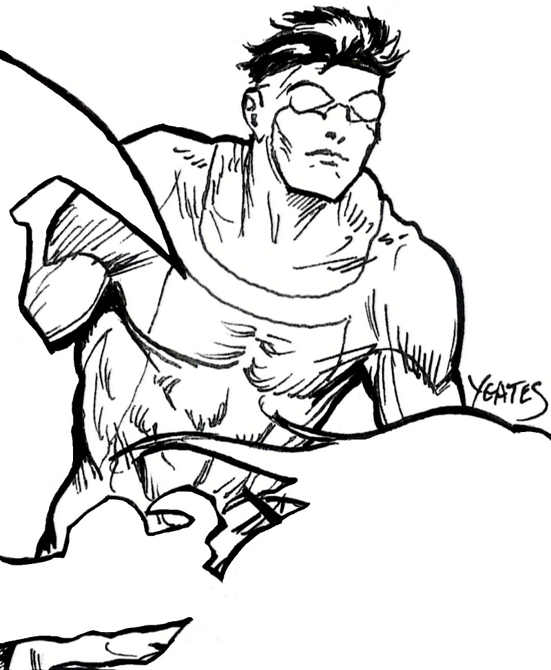
"I wanted to check up on characters to fill it out with, because I have some space. As you can see so far I've included The Jungle Queen/Julie, She-Dragon, Boof and two Bruise Crew members, Bomb Queen and Trencher."
Monday, July 26, 2021
2019 Fandemic Tour Supreme colors by Daniel Dahl
As previously mentioned, Gilbert “Beto” Hernandez's sketch for the jam had a light touch, so Evan Dorkin helped to fill out some of the details. I still wanted Supreme to be a bit meatier, especially standing next to Linsner's Spawn, and that effort would ultimately fall on the shoulders of the colorist. I attended the last Fandemic convention in Houston before COVID, but I was out of pocket from a trip a couple months earlier. I don't recall if I had a specific reason for going, or if I even went both days, but I wasn't rolling heavy into this particular show. While browsing tables, I came across the work of Daniel Dahl, visiting from Minnesota and seeming to specialize in sketch cover variants. I liked his line work, but wasn't really in the market to start new pieces while I still had lingering jams to finish. However, he was particular good with the color work, using it to add depth and weight to his pieces. He felt like a perfect fit for what I was looking for in Supreme, and while Xerox scans are notoriously bad at capturing subtlety of color, I think you can still see that he knocked it out of the park. I loved his work so much, I got him to do a couple characters, as you'll see in the future...
Daniel Dahl
Sunday, July 18, 2021
2017 Heroes Convention Image Comics 25th Anniversary Jam Background Rough Layout by Evan Dorkin
As previously discussed, I knew that I wanted Evan Dorkin to be part of the jam, both for his being an independent comics creator that predated Image Comics, but also because he'd successfully transitioned between indie projects and work-for-hire at Marvel, DC, Dark Horse, and even Bongo Comics. It's a bonus when the artists didn't have any particular association with Image, even though the whole thing started with Linsner, and Alan Davis did a fair amount of Wildstorm work. Anyway, I was introduced to Milk & Cheese through one of their hilarious Slave Labor Graphics specials, then moved on to Instant Piano and DORK!, though today he's probably best known for The Eltingville Club, Beasts of Burden, and his TV work for shows like Space Ghost Coast to Coast. He's a long time favorite with a cult following and a shelf full of Eisners, Harveys, and Ignatzs. Ignatzes? Is Ignatz already the plural of Ignatz? I know it's a z, but it has an s-ish sound, right?
My buddy Fix has had a massive Milk & Cheese piece for decades that I've always been envious of, so even without the jam, I'd have wanted to get something from the artist. As with Howard Chaykin, I was intimidated on approaching Dorkin, known for an acerbic, withering wit. Also like Chaykin, he turned out to be a delight, so I needn't have worried. My girlfriend and I talked comics, movies, et cetera with Dorkin, and he put up with all my comings and going to navigate the piece and determine his role in it. After passing on Shadowhawk and debating options, we settled on the Savage Dragon as the best fit. However, with all of the Heroes Con elements finished, I went back to Dorkin and asked "How would you like to ink Neal Adams?"
In truth, he wasn't exactly enthused, but the Pitt layout was exceptionally loose. After some discussion, it was decided that Dorkin would "finish" the piece, providing needed embellishments, extensions, and background elements to round out the art in total. Besides doing Dragon and tightening Pitt, we primarily talked about adding a bunch of Isz from Sam Keith's The Maxx and random EXTREME! '90s elements. Despite his self-deprication, Dorkin never does anything halfway, so before long we were both researching additional characters to squeeze into the margins. Above is a heavily contrasted scan the artist used to show me his general course before we'd really gotten to talking. You can see that even at this early stage, there's a huge improvement in making everything feel interconnected, rather than a collection of toys bunched together in negative space...
Monday, July 12, 2021
2017 Heroes Convention Image Comics 25th Anniversary Jam WIP
While never the most reliable show in our stable (are any of them?) Spawnometer really derailed in May. Blame falls on both co-hosts getting swallowed up at different times so that we could never align long enough to knock the next one out. That said, Frank does all the art posts, and has had plenty of opportunities to maintain the blog on that front. But hey, it wouldn't be an Image Comics project without interminable, unexplained delays, right? I had a kid and moved back to the Philippines after proposing to my girlfriend via a three page comic strip while building a recording studio for my band! What do you want from me?
As an apology, let me finally offer the incomplete jam where it was left at the end of Heroes Con. This is far from the finished piece, as you'll begin to see next week, but so far as what got done at the con, this is fully representative. It's a shoddy photo though. I'm going to try to pin Fix down and do a few episodes in coming weeks to hopefully return to a regular schedule in August. So, from one "A" month to another?
Sunday, April 4, 2021
2017 Heroes Convention Spawn Color Jam Figure by Joseph Michael Linsner
A mere four years after the fact, we can finally double back to look at the alpha and omega of the Heroes Con jam, Spawn. Dawn creator Joe Linsner produced this first figure's line art, then I borrowed the piece from him for further additions. I was still moving the piece around the floor when he flagged me down to apply the color while he had time in his schedule. To be honest, I was so happy with the basic figure that it was worth the expensive I'd paid up front for color, and I'd considered kicking out more money to see if he could color other figures. My grand ambition to complete the piece on the floor of the con that weekend was looking dimmer all the time though, and it seemed best to just get Spaen completed and worry about the rest later. The colors are as gorgeous as I'd expected, and my one regret is that I only have a few blurry photographs at this stage of the jam, pre-&-post Pitt, taken on the floor. For the instance of showing off Linsner's colors, I've taken this image from a later scan and tried to clear away elements that might distract from the core Spawn image.
Sunday, March 28, 2021
2017 Heroes Convention Pitt Jam Sketch by Neal Adams
I believe that by this point, it had already been determined that Evan Dorkin's contribution to the jam would be provided after the convention. I still tried to get in a few quickies like WildStar before turning the piece over, because I still wanted it to be a HeroesCon 2017 piece mearly "finished" after the fact. Despite not being an official Image founder, I felt that Dale Keown came in early and was important enough to rate inclusion. I'd already been refused by indie/self-publishing legends like Jim Steranko and Frank Brunner, so I figured Neal Adams of all people was a huge longshot. No creator came closer to creating an Image Comics before the Marvel Exodus than Adams, one of the most important figures in the history of comics, and easily one of its greatest and most influential artists. Also, while Bernie Wrightson is his most obvious antecedent, Keown's style seemingly owed no small debt to Adams.
Again, we're in the last hour of the show, I see Adams on Pitt as a total Hail Mary, and was frankly shocked when he said yes. Adams drew some of my earliest favorites as a comic book fan, so it was a big deal to get original work from him on short notice at a reasonable rate. He knocked it out while I watched, and admittedly this is a layout at best, but it still pleased me immensely to get something I specifically asked for (and will unlikely ever be replicated) by someone of Adams' stature. Also, frankly, Neal Adams is an intimidating guy with an imposing reputation, so the fact that I also own a Martian Manhunter head sketch and got Adams to agree to a very brief (by design) interview is a source of pride to me. I've had nothing but entertaining experiences with Neal Adams.
Tuesday, January 19, 2021
2017 Heroes Convention Shadowhawk Jam Figure by Joe Staton
Jim Valentino's Shadowhawk is the last of the core figures of the jam that I'm presenting here, but probably the second or third contribution to the jam. I think I misremembered the process previously, and had Linsner keep the initial Spawn drawing overnight. The next morning, I think he had the linework either in process or done, and that's when I asked to circulate it around the convention. I only have one photo of the black & white Spawn (joined by Beto's Supreme,) and it was either taken back in the hotel room on the first night or on the showroom floor on Saturday. All the other pictures have Spawn in color, and I'm still trying to tease out that reveal, which explains the awkward cropping and late arrival of Paul Johnstone here.
I know that I at least talked to Evan Dorkin first, because I specifically remember him begging off of drawing Shadowhawk because he couldn't understand the helmet. And I mean historically, not just when I offered it as one of several options. Dorkin selected another character, and didn't want the time pressure of a jam in progress, so we discussed my coming around again for his contribution. So most probably, it went Spawn, Supreme, Witchblade, Shadowhawk, Huntsman, Invincible, The Maxx, and Fortress. Both Tim Vigil and Joe Staton are notably fast artists, so they would have been ideal choices to catch-up for lost time on Saturday while my girlfriend held my place in line for Alan Davis.
Joe Staton was one of those inescapable artists when I was growing up in the Bronze Age, and I'd say my favorite work was his collaboration with Steve Englehart on Green Lantern Corps. He earned his creator-ownership pioneer credentials through his co-creation of E-Man with Nicola Cuti in 1973. Initially appearing at Charlton Comics, the energy being starred in one of First Comics' earliest titles, and offered a showcase for numerous other creators' properties. Steve Ditko even did a couple of Killjoy back-ups there. E-Man also made his way through Comico, Digital Webbing Press, and a few Charlton revival publications. E-Man was even part of the War of the Independents, a small press mega-crossover of several hundred indie characters. While Staton was an art director at First for a time, he's probably best remembered by comic book fans as a DC Comics fixture throughout the Bronze Age into the '90s. In the 21st Century, he mostly handled cartoon adaptations like Scooby-Doo for them, but also took over the Dick Tracy newspaper strip.
Staton's a good guy who took on the unenviable task of not only drawing that damned helmet, but also cramming Shadowhawk into a small space between a defined arching horizon line, Supreme's forcing his head down to the height of Al Simmons' ass, and into the curve of Spawn's pose with all the typical accoutrements (huge cape, swinging chain, clawed hands, etc. Most any other artist would rightly have told me to scram or done some low-down half-effort, but Staton is such a masterful pro that he made everything work perfectly in scale. These jams can be a nightmare and easily fall apart, so you don't know what a lifesaver a talent like Joe Staton can be, delivering under these circumstances.
Monday, November 9, 2020
2017 Heroes Convention Fortress Jam Figure by Jaime “Xaime” Hernandez

It's been three years, so a lot of the details of pulling together this jam are lost to my fading memory. The way I think it worked was that we started on Friday, and Joe Linsner had it for most of that day. I had my mind set on completing the project over the weekend, so I begged it off him after he'd just done the finished layout so that I could get in some more contributions on that first day. I believe my second stop was Gilbert Hernandez, because the only character I wanted him to do was Supreme, and I was pretty confident that he was going to turn me down. To my happy surprise, Beto agreed, and his Silver Age influenced style was well suited to Image's Superman. Getting an early start the next day, I think I got Witchblade and Shadowhawk done within the first few hours. My beloved girlfriend meanwhile waited three hours to hold a place for me in Alan Davis' line, so that's when The Huntsman joined the line-up.
Most probably, this is where Jaime Hernandez comes in. I desperately wanted indy creators with the esteem of Los Bros Hernandez on this project, and you'd have thought I'd have tried to wrangle Xaime right after Beto. However, I felt like there were a greater variety of Image characters that fit Xaime's style, and no one that I was married to, so he remained my wild card for a while. He could have done Huntsman, but I really wanted the connection to Claremont that Davis provided. I thought he'd be great for Invincible, and I suspect I gave him that as one of several options, but I believe he went for Fortress instead.
I can never remember Fortress' name, always confusing him with Bunker from the New 52 Team Titans. Obviously, Image co-founder Whilce Portacio is most associated with his creation of Wetworks, which I disqualified because they were ultimately owned by Wildstorm and sold to DC Comics. He'd also done Stone for Avalon Studios, but I don't recall if he holds rights over that. Baxter Montgomery was created for and almost exclusively used in the aborted crossover event Image United featuring all of the Image founders, and "dude in armor" at least alludes to Wetworks. He seemed like the best bet, and I think Xaime get a kick out of drawing him. There's a lot of detailing in the armor, and I especially like how he caught the unique separation between the arms and torso. I feel like Portacio was doing an action figure / Inhumanoids riff that gave Fortress some visual distinction. I also dig how Fortress seems poised for a Kirby punch-out.
Sorry for the low quality jpeg. I only took pictures with an aging digital camera in the hotel room on the second night of the con, and the piece didn't make it back home to me until substantial changes were made to the overall piece. I feel that this is the best representation of Hernandez's original linework in isolation that I have available to present without obliterating his pencils through excessive contrasting brightening things up.
Saturday, July 25, 2020
2017 Heroes Convention The Maxx Jam Figure by Scott Shaw!

I occasionally read Captain Carrot and His Amazing Zoo Crew! as a kid, and given the secret identity of Sam Kieth's The Maxx, it amused me to pair the character with funny animal cartoonist Scott Shaw! (decorative exclamation point his, as in Elliot S! Maggin.) Aside from his 18 issues on that title, the majority of Shaw's work has been outside the big two, on licensed properties like The Simpsons, Sonic the Hedgehog, and Shreck. As for his qualifications as an indie comics pioneer who predated the Image boys, Shaw goes all the way back to 1974's Comix Book #1. If Marvel's involvement with that project makes you look askance, there's always You-All Gibbon in 1976's Quack, 1977's The Barn of Fear, and his contribution to Jack Kirby's lawsuit fund against Marvel in Destroyer Duck #1. Anyway, Mr. Shaw was having a good time at the con, and drew the Maxx while I waited.
Monday, June 1, 2020
2017 Heroes Convention Spawn Jam Figure Layout by Joseph Michael Linsner

JML's bona fides for the piece are clear. Small press comix weren't really viable after the scene around the undergrounds faded. Then there was a huge boom in black & white books fueled by the enormous success of the Teenage Mutant Ninjas Turtles that led to an equally huge bust in 1987. Variety wrote about it. Most of the publishers and talent were finished forever, their books lined quarter bins, and retailers once burned were twice shy about ever giving black & whites the time of day. Then Joes Linsner and Monks founded Cry for Dawn in 1989. Between the best twist-ending horror stories since EC folded, the glorious gray-tone interior art, and the sensual cheesecake covers featuring the scarlet-haired quasi-hostess Dawn, CFD sparked a Turtles-like demand for multiple printings on every issue and skyrocketing back issue prices. There was even a plague of counterfeit #1s that forced buyers to scrutinize potential purchases for reproduction flaws.
After a bitter falling out with Joe Monks, Linsner started his own Sirius Entertainment to publish a slew of color and B&W titles, including the first actual stories for Dawn. The company survived the bust, at least for a few years, but Linsner eventually gravitated toward his former competition at Image to continue his tales. He's still an in-demand creator, now mostly occupied with work for Dynamite Entertainment, but he still occasionally contributes to Image (including a cover for Witchblade #100.)
As much as we love Linsner's ladies, we really wanted to take advantage of his goth and metal roots for the preeminent Image icon, Spawn. The artist was game, and though the intention was to get everything in black & white, who could resist the opportunity to get color work from him? However, color takes time, which was deeply deficit for a jam this ambitious. Eventually, Frank stole away with the line art to seek out further contributions, like Beto's Supreme. The photo above was the only opportunity he had to record Linsner's excellent linework before the coloring took place...
Sunday, May 10, 2020
2017 Heroes Convention WildStar Jam Headshot by Paul Gulacy

Wednesday, April 29, 2020
2017 Heroes Convention Witchblade Jam Figure by Tim Vigil

Wednesday, March 4, 2020
2017 Heroes Convention Invincible Jam Figure by Thomas Yeates

Truth to tell, Frank has never been particularly passionate about Mark Grayson, if for no other reason than he's guaranteed to never be the most famous and iconic comic book character with that surname. He even looks a lot like Dick. However, the Image "I" costume is distinctive and positions Invincible as a standard-bearer for what remained of the company's shared super-hero universe by 2002. Co-creator Robert Kirkman himself became the most successful of the post-founding creators, mostly due to the enormous impact of The Walking Dead, which eventually earned the writer a partnership. Despite the end of both series and Kirkman's rapidly decreasing comics output, his Skybound Entertainment is still one of Image's most profitable production studios. It was basically a given that he would rate inclusion in this jam, and Invincible fits the group shot a lot better than Rick Grimes (though Michonne would have helped the gender balance.)
Thomas Yeates was perhaps an odd choice, given his tendency toward more grounded comics fare, like supernatural horror (Frank was introduced via Swamp Thing) and old timey pulp characters (Zorro, Tarzan, Prince Valiant.) Because of the complicated parameters concocted for eligibility for participation in the jam (he's included thanks to the creator-owned '80s Epic series Timespirits,) and Frank simply wishing to reach out to some new talent amidst the smorgasbord that was HeroesCon, Yeates was always an option for a spot. By this point in the jam's progress, it was probably the sixth addition, so the marriage of character and artist was more about which remaining options seemed best suited to Yates' strengths. Savage Dragon? Not so much.
Thankfully, Yates was a sport about doing a super-hero, and cramming his figure between a couple or three prior installments. It blessedly turned out quite nice and quite quick (can't recall if it was done while Frank waited or more of a one hour turnaround.) This part was probably done late Saturday or into Sunday, and time was running out...
Wednesday, February 5, 2020
2017 Heroes Convention Huntsman Jam Figure by Alan Davis

So here's a sticky choice made by Frank-- he didn't want to include any of Jim Lee's characters, since they were sold off to DC Comics, literally one of the big two surviving comic book publishers around since the beginning with one of the greatest accumulations of sins against creators on record. Deluded that this jam might actually appear in an Image comic someday, he didn't want any compromised copyrights that might force a later exclusion, like when Michel Fiffe Image Jam #1 erased Void when it appeared in an issue of Savage Dragon. Same went for Alan Moore's 1963 characters, which became another rights boondoggle when Moore abandoned them (and then had his own America's Best Comics sold to DC by Jim Lee.) So how do you acknowledge the formidable presence of Jim Lee as an Image founder without using any of his creations?
Use one of Chris Claremont's, Lee's writer during his run on Uncanny X-Men. The debt WildC.A.T.s owed to Claremont is... measurable, come to think of it. That's probably why Claremont was (I believe) the first writer invited to publish their characters through Image, and he did so via a guest stint on said book. At one point, Huntsman was going to be Whilce Portacio's Image book as well, but Claremont was off in Paris at the time and Whilce wanted to get moving on a title... about another couple years later. Anyway, Lee drew most of Huntsman's appearances that weren't done by another ex-X collaborator, Marc Silvestri. Huntsman is still owned by his creator, and the association with Lee made him a good Wildstorm stand-in.
Since we're all about X-Men artists, another of Claremont's longtime collaborators who was also an influence on Lee and did work for Wildstorm was Alan Davis. In a better world, we might have had Claremont & Davis' Huntsman instead of Sovereign Seven and ClanDestine being consigned to the dustbin of Chromium Age historical footnotes. Davis also drew Alan Moore's seminal super-hero deconstruction Miracleman, which added layers of subtext by not only referencing Moore in a Jim Lee analog, but also a "creator-owned" property that was ultimately gobbled up by the other of the Big Two, Marvel (not to mention further tying into the McFarlane/Gaiman legal battle that cost the former the rights to Angela.) An absolutely delicious context cake!
That said, getting Davis would be a laborious longshot, but thankfully Frank has one of the world's great girlfriends, who stood in line for three hours to wait for him while Frank continued to move the jam around. Davis was doing while-you-wait quick pieces for charity (HERO, I think,) so it was a mad sprint once the call went out for Davis' availability. Given how many smiling faces Davis draws on his characters, Frank was amused by how crabby he was about drawing Huntsman. He complained the whole time about the inadequacy of the reference and the shortcomings of Lee's rendition of the character's costume and accessories. Regardless, worth it!
Side note: for those who would grouse about the exclusion of Wildstorm properties, several ultimately were included in the background at the choice of the final artist, who filled-out the jam with a multitude of additions.
Wednesday, January 1, 2020
2017 Heroes Convention Supreme Jam Sketch Detail by Gilbert “Beto” Hernandez
Subscribe to:
Posts (Atom)